You in Review
You in Review is an interactive lifestyle tracker that helps the user keep good habits by using push notifications to actively remind the user to stay on track.
Whether the user is trying to start a new good habit or kicking a bad one, You in Review uses an aesthetically pleasing interface with detailed insights and data to keep the user engaged and motivated. As someone who is into fitness and trying to maintain a healthier lifestyle, I was happy to design and develop a tool to help keep better habits.
Problem
There needed to be a more universal lifestyle tracker instead of having multiple trackers designed to help the user consistently track, without overflowing the user with notifications. The app should be clean and simple, yet motivating in a way to have it seamlessly integrated into their lifestyle.
Solution
The app should be appeal to the user by motivating with color. As the user inputs more data, the more detailed and color-filled the app gets. The more progress the user sees, the more likely they are to keep good habits. The user also gets a detailed insight of how their habits are for the day, week, month, and year.
Deliverables
// UX Research
// Wireframes and Mockups
// Branding
// Style Guide
// Usability and Preference Testing
// Figma Prototype
Research: Understanding Tracking Habits
User Survey
In order to better understand the behaviors of current trackers, as well as non-trackers, I conducted an online survey to get a general consensus of lifestyle tracking. I wanted to know:
What kind of habits were people tracking?
How are they tracking it?
What can be improved in their current way of tracking?
What are some reasons for non-trackers to not track?
Would non-trackers be interested in tracking if they wanted to start a good habit or stop a bad habit?
After a couple of days of collecting results, I found that:
56%
of people are currently tracking.
88%
use some sort of mobile app and/or wearable device.
58%
of mobile app trackers wished it was more interactive.
Top 3
categories are: exercise, food/calorie intake, and mood.
70%
of non-trackers found it to be too much work.
80%
of non-trackers would be willing to try.
I also came across a response that really stood out to me:
“I wish there was a way I was able to actually keep a habit, not give up after a week. I have ADHD and think that makes it a lot harder, it feels like most apps are made for very neurotypical people.”
So, I really wanted to make sure this app was interactive enough that it didn't become something users eventually forgot about.
Competitive Analysis
I also took a look at some existing lifestyle tracking apps such as Fitbit, Habitica, and Simple Habit Tracker. I wanted to see what worked with each one and what I could do differently.
Fitbit: This is actually the current lifestyle tracker I use.
It uses an extra tracking device, to track your steps, heart rate, workouts, and even sleep.
Due to lack of interaction, the user can go days without looking at the app.
Can set step or exercise goals, but lack of notifications to push me to reach my goals, even if I’m really close.
Habitica: This gives lifestyle tracking a new take and turns it into a game.
Users are rewarded with points for completing a habit for the day.
Users can level up and customize their avatar with the points.
Only tracks daily habits, and users aren’t able to see long-term progression such as weekly, monthly, or yearly.
Simple Habit: This app encourages users to practice good habits by going on a 21 day challenge.
The app is well organized and color coded.
Users are only able to view weekly progress.
Users aren’t able to continue tracking the habit once the 21 day period is over.
User Personas
After conducting my research, I thought about who the target audience would be. I wanted the mobile app to appeal to a wide range of people, which meant varying interests in lifestyle tracking.


Information Architecture: Planning the Tracker
User Stories
With these three people in mind, I created a list of tasks I wanted the app to be able to perform, and rated their importance from High to Low.
Task - New User
I want to create an account.
I want to start tracking a new good habit.
High
High
Task - Returning User
I want to see daily data.
I want to see the progress I have made.
High
High
User Flows
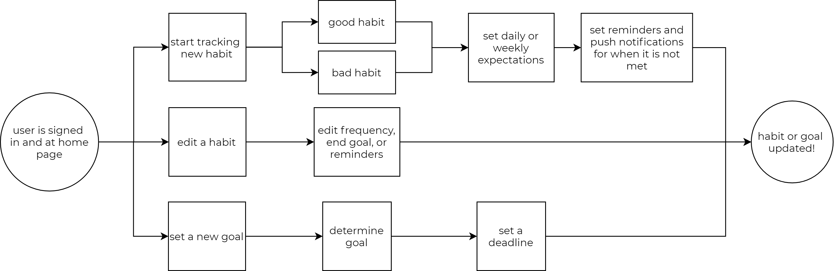
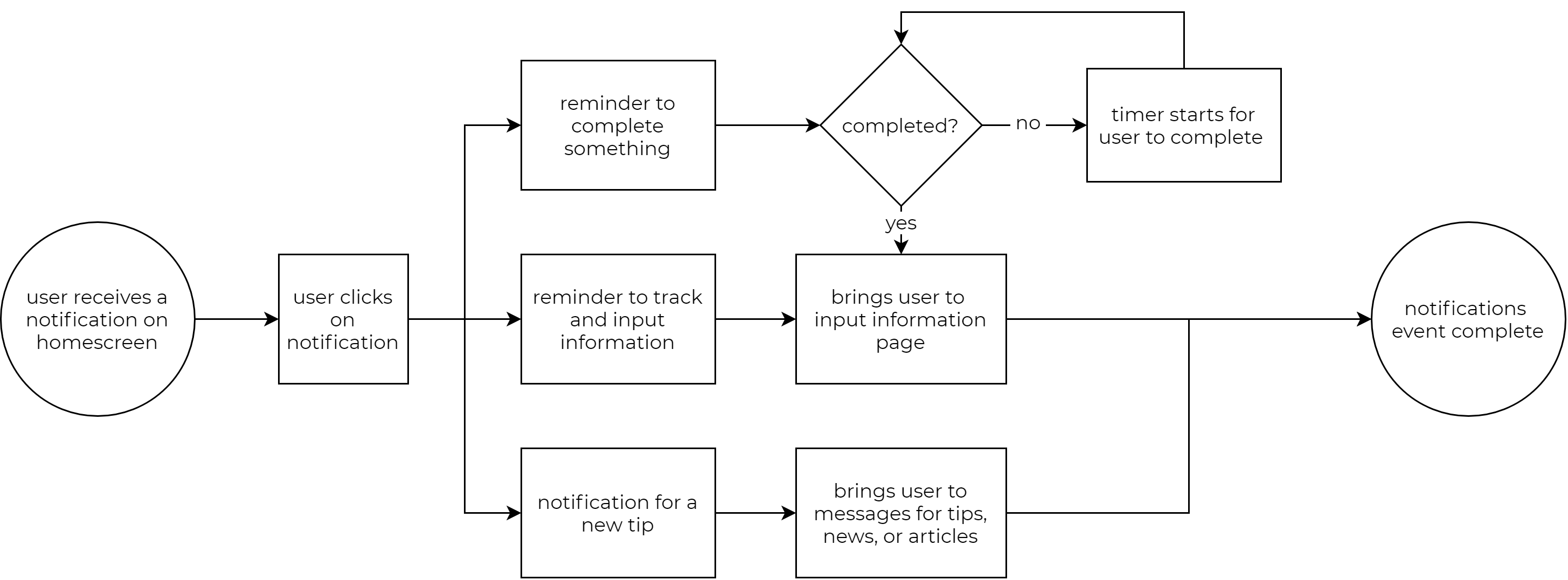
Based on the importance of the task, I created flow charts of the steps a user would have to take to achieve these tasks. While there are a lot of things that needed to be implemented, the top three user stories were for creating an account, adding new habits, and most importantly, notifications.
1. As a new user, I want to create a new account.
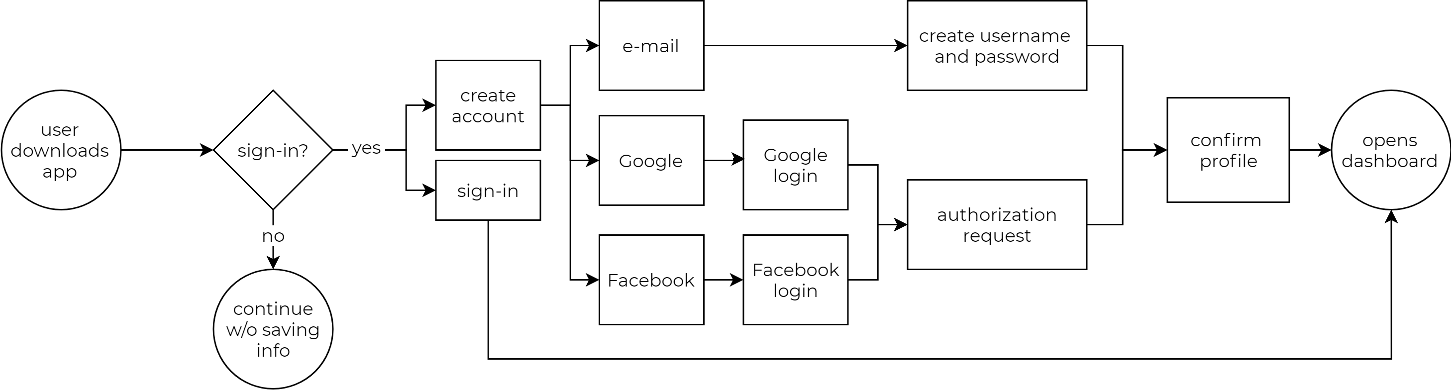
2. As a user, I want to start tracking a new habit.
3. As a user, I want reminders and notifications to keep me engaged and motivated.
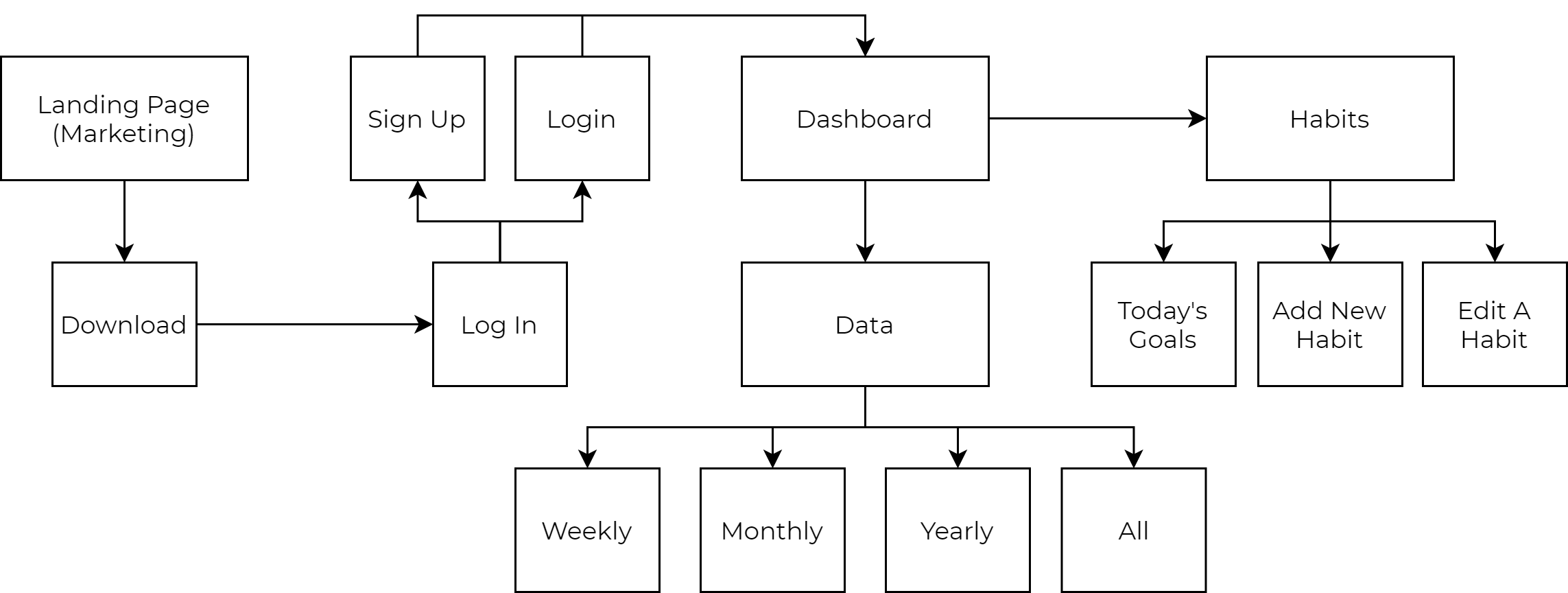
Sitemap
With user stories and flows planned out, it was easy to stitch the pieces together with an overarching sitemap. This helped create content strategy, and provided a reference to look to when designing the screens.
Wireframes
With the everything planned out, I was able to start building the wireframe for the desktop website. I started ideating on paper, trying to get a general feel of what the website should look like, and to make sure all my frames checked off all the tasks of the flow chart.
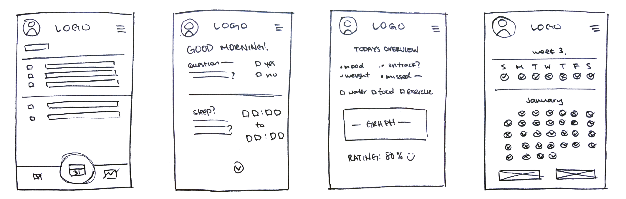
After that, it was easy to transfer my drawings onto Figma. With the basic structure of the website, sans design, color, font, or images, I was able to hash out the general flow of how I wanted things to go.
Branding: Warm & Inviting
Logo
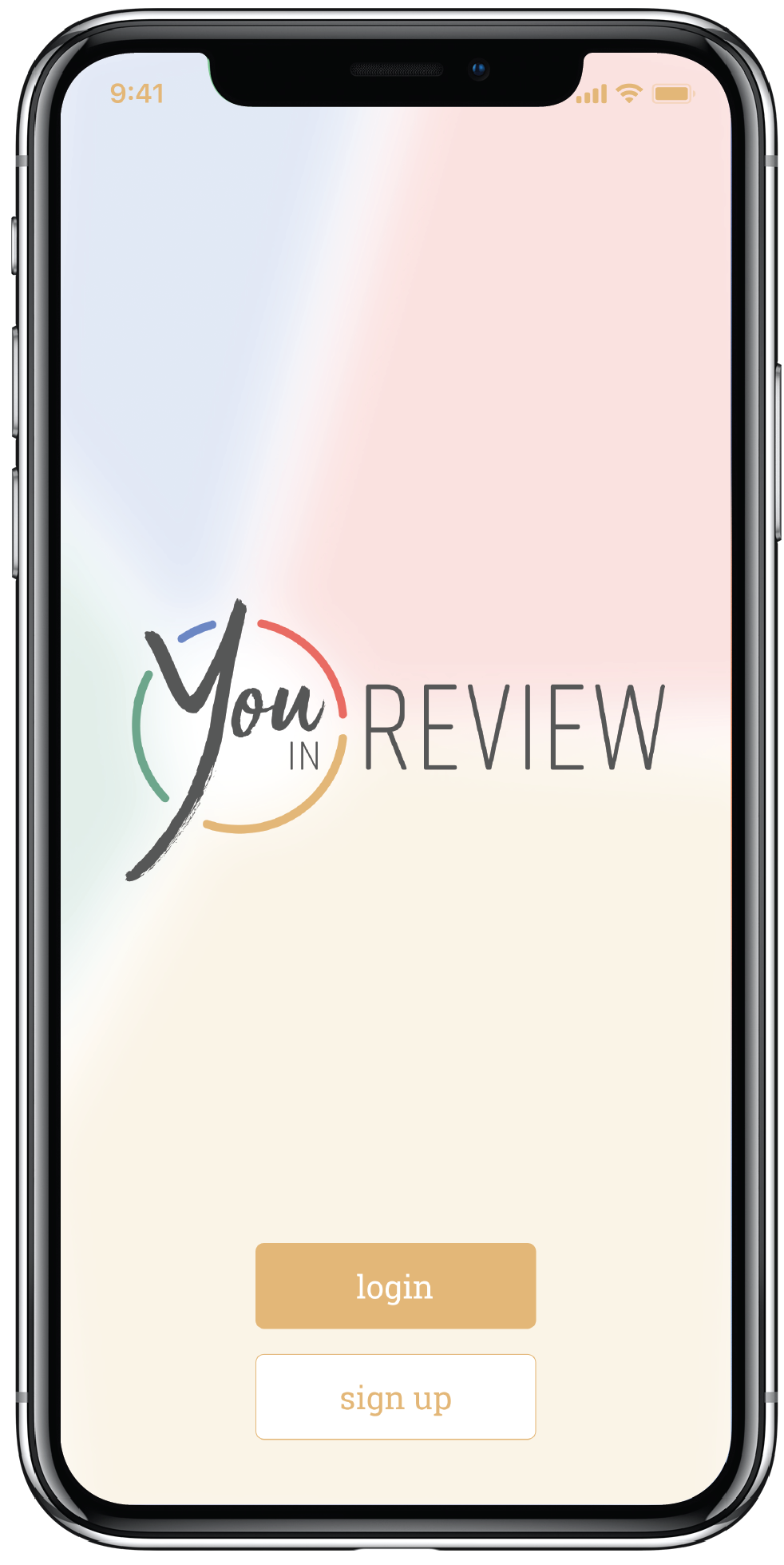
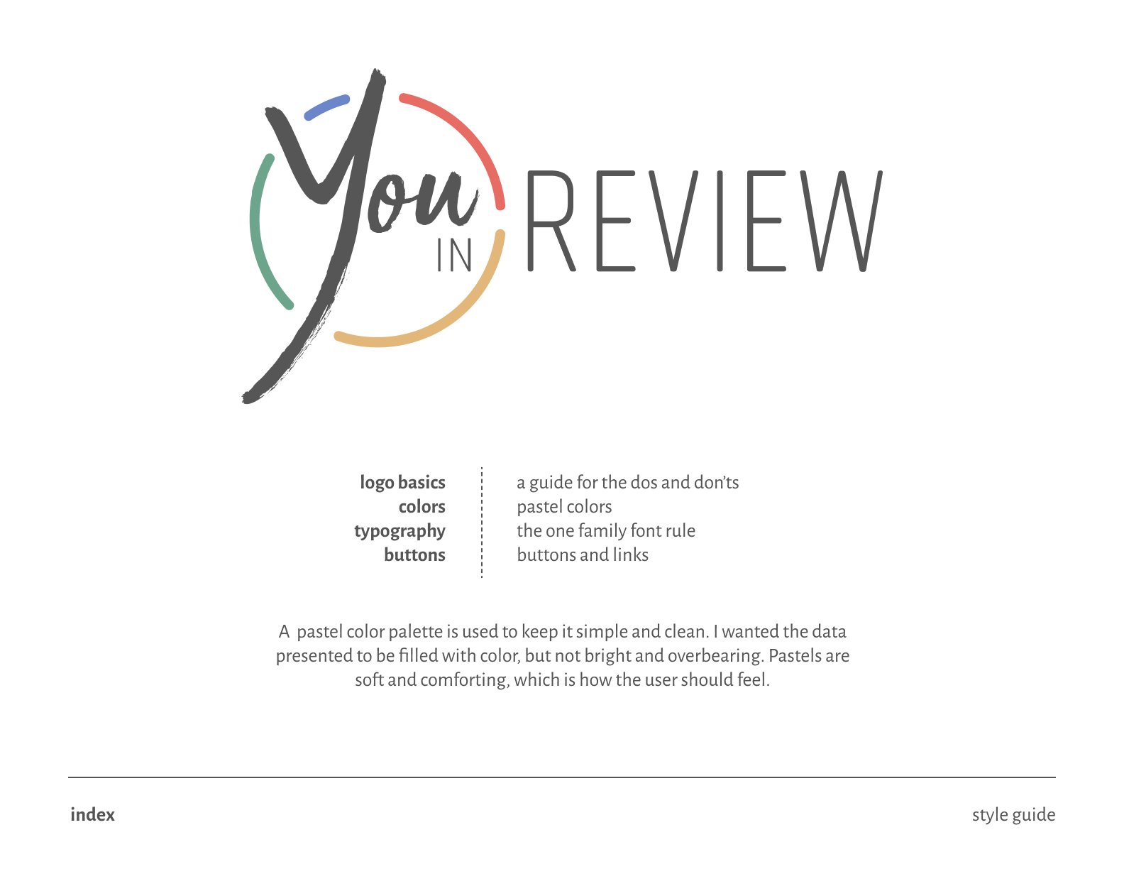
Since my concept relies heavily on color, I knew I had to lock down an aesthetically pleasing brand. I started off by choosing a name for the app, ideating off words that centered around health, habits, and lifestyle. I decided on You in Review, which perfectly represents the data insights the app provides.
To further tie in the brand to the logo, I incorporated an element directly from the app itself, and used that to create a make-shift circular border around the word “You”.
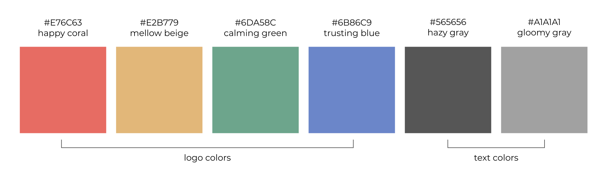
Color & Typeface
I wanted the colors to be be centered around the four categories, so I chose two cool and two warm colors to be the main color palette. I also needed a main color that kept the whole thing together, so I decided on choosing the golden yellow since it seemed warm and inviting. With these colors in mind, it was easy to incorporate them in the logo.
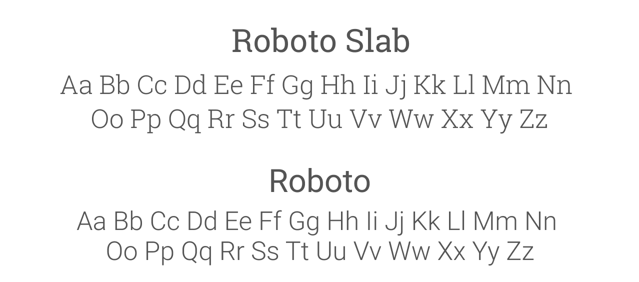
I chose a typeface that was easy to read, while playing on a medicinal aesthetic. I wanted to pair a serif with a sans-serif, so I chose within the same family.
Style Guide
After finalizing a logo and essentially a brand, I wanted to make sure everything was consistent with one another before “dressing up” the wireframe. Creating a style guide, or a set of standards allowed me to make sure I didn’t have slightly different variations of the same color, or font that kept on changing as you used the app.
Prototypes & Usability Testing
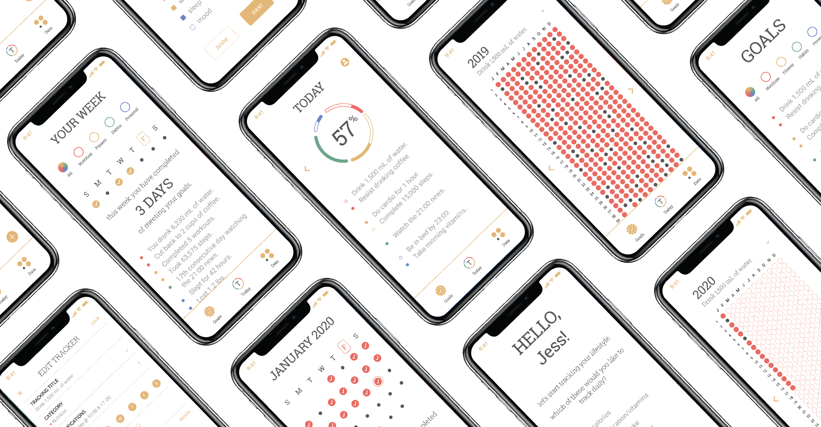
Motivating By Color
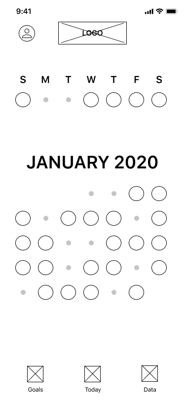
In order to motivate and engage the user to consistently track and use the app without overflowing the user with notifications, I decided to use color as a motivator. As the user inputs more data, the more detailed and color-filled the app gets. The more progress the user sees, the more likely they are to keep good habits.
Hi-Fidelty Prototypes
With my Style Guide established, I was able to incorporate it into my wireframe and make a working prototype. After finalizing those changes, I wanted to make sure the prototype would be usable without any kinks, so I conducted some usability tests.
Usability Testing
I ran tests by giving them instructions to complete the onboarding process, as well as navigate through the app to see goals and data. It was very interesting to see how different people perceived the design. Specifically between one who was more creative, and another who was more logical. It really put my design and intentions into perspective, and how I could tweak a few things to make sure I got my point across.
I made a list of tasks for them to accomplish:
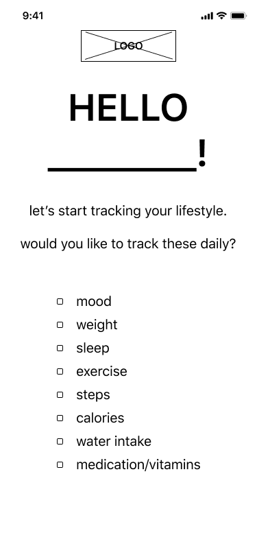
Begin and finish the onboarding process as if you were a new user.
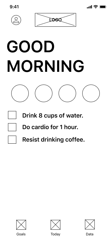
Complete morning check-in.
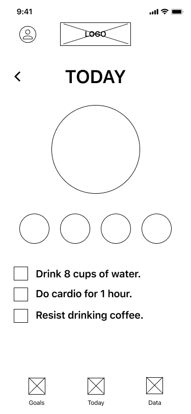
Take a look at Today's Goals. What can you tell me about them?
What can you tell me about Yesterday's goals?
Navigate to the Data section and tell me how you're doing for this week's goals in the category for Food.
What about for the month? And for the year?
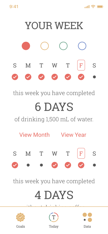
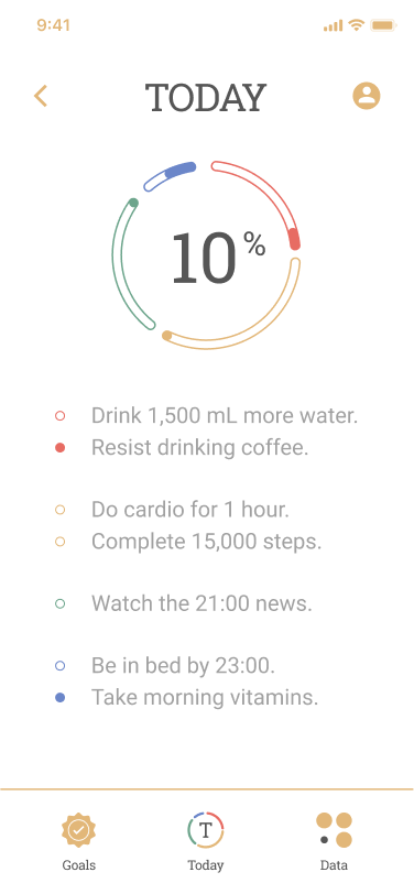
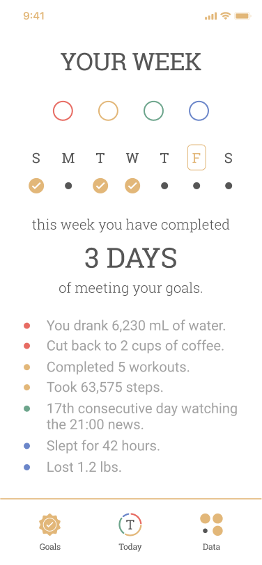
Weekly Data
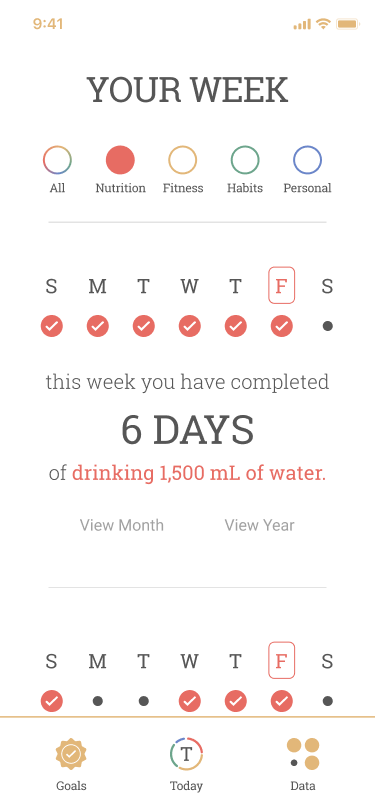
Weekly Data
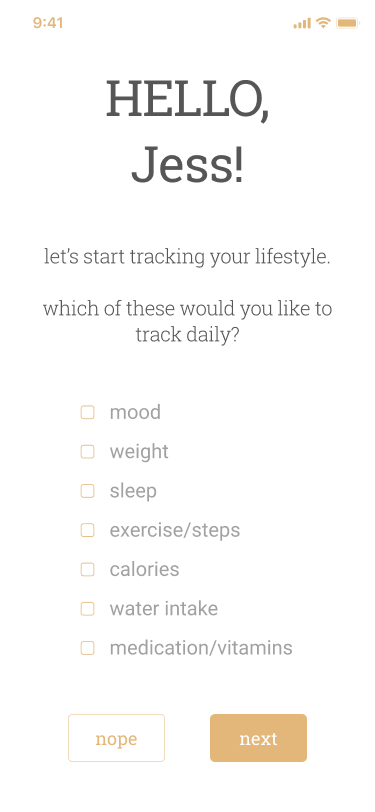
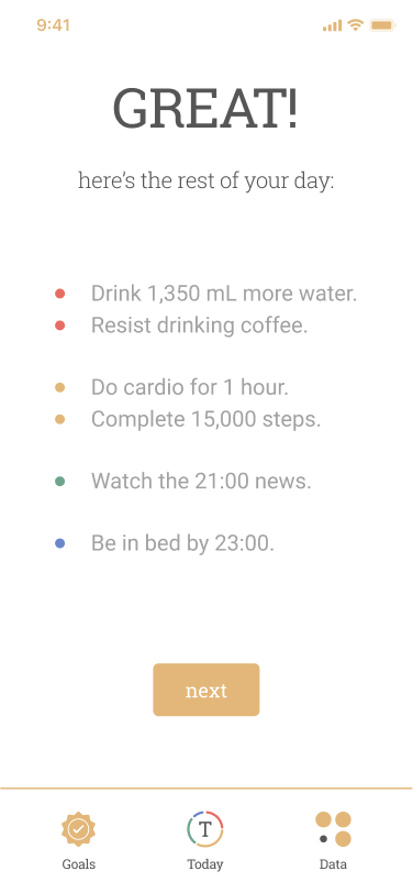
Onboarding
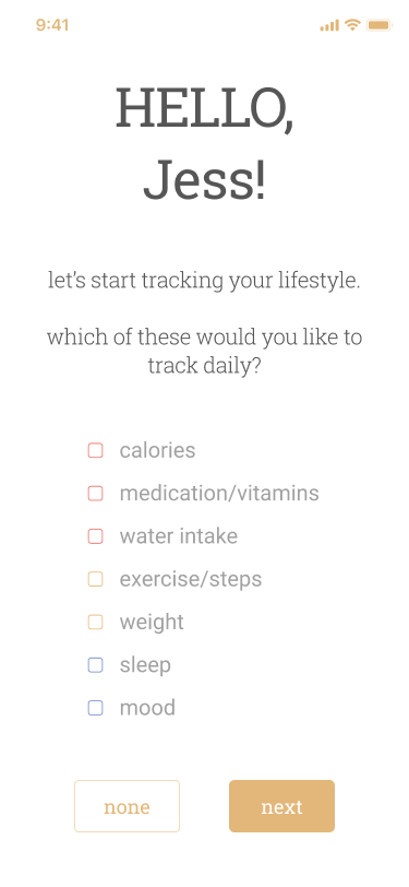
Onboarding
Tracker Pop-Up
Tracker Pop-Up
While the users can agree that the app is clean and aesthetically pleasing, there were some minor changes that needed to be made in order to make some buttons and its intended functions be more consistent and clear. Spacing issues was also a problem on some of the pages, where it was a little cluttered.
Conclusion: Last Thoughts
While I am overall happy with the final prototype, usability testing also brought up some interesting concerns that I hadn’t thought of that I could address in future developments. Although this app was intended to use color as a motivating factor, there is room to develop for colorblind people.
It was also brought up that the year view in data analytics might set off trypophobia for some people, so I would need to address that as well. Other minor developments would include smaller preference settings such as choosing between 12 hours vs 24 hour time, integrating other motivating factors such as words of encouragement, and habit tools such as integrating hourly data inputs and water intake suggestions.